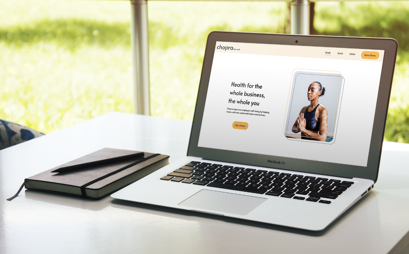
Chopra Meditation & Employee Wellness
Design Goals
The client
Chopra is a popular meditation app and website that provides personalized daily sessions, meditation knowledge and tips, and well-being challenges to relive stress and anxiety.
The challenge
I wanted to find a way to make meditation and mindfulness practices more accessible and widely spread, and I thought what better way to do this than to promote meditation in the workplace.
The solution
I decided to add a new feature on Chopra where business owners and team leaders could sign up for subscriptions in bulk to give to their employees as a part of their corporate wellness programs. This would allow employees to have access to solo and group meditations, mindfulness practices, and articles that would all be paid for my their employer.
Initial Research
Survey: At the discovery phase of this project, I worked with my team to distribute surveys to get a better understanding of the subject’s feelings toward meditation and access to mental healthcare resources. I was curious to see if the subjects would find it beneficial to have a meditation app subscription, and if cost was a barrier that kept them from buying one themselves. I found that cost was indeed a factor, especially when there are so many free alternatives that are pretty easily accessible already. I then decided to proceed with the development of this feature in order to make the app that we chose, Chopra, more competitive against other meditation subscriptions that already offer employee wellness programs.
User Personas
Based on the survey results and the research, I set up three personas. I referred to them throughout the entire product development process.
I included personas so that I could better empathize with the potential users of this product. I also wanted to highlight their wants/needs and frustrations so that I could create a product that fully met those needs.
Role:
Project Manager, Researcher, UI Designer
Timeline:
2 mos
User Journey Map
The Journey Map illustrates the steps an employer would go through to set up a group meditation for their employees and their thoughts and emotions they experience while completing these steps.
I wanted to make sure that this was a simple process, even when the employer experiences a bump in the road when he realizes that not all of his employees have signed up for the membership properly. The user journey goes through how this issue is solved and how quickly each step is completed.
Usability Testing
After completing the wireframes, then came time to test out the usability of the product. I conducted these tests by having each of our subjects browse around the site while I asked them some questions. These included some open ended questions to gather how the user was feeling while navigating, and also some tasks that I wanted the users to complete. This allowed me to see if the user flow was intuitive or not, and if the user struggled at all along the way.
After conducting all of the usability tests, I analyzed each interview and transcribed the recorded videos through Otter.ai. While watching the videos and reading through the transcripts, I focused on body language, voice inflection, verbal feedback, and where they clicked on the site/didn’t click. I also took notes while the tests were being conducted and referenced those notes while synthesizing. In order to synthesize the data, my team and I organized our takeaways and insights by affinity mapping on FigJam.
UI Designs
Once I tested out all usability mistakes and issues, I started designing the final screens in Figma. Since this is a meditation site, I wanted the design to feel light, fresh, and relaxing. Each page is laid out in a way that is not overwhelming to the user and I made sure to balance the amount of text with images. I also chose simple and clean typography to go with the design.
The parts that I like the most are the small details found throughout the site, which includes the organic shapes and outlines around images. While these details are small, I think they add a lot to the tone of voice of the brand and make the design more dynamic and fun.
During the usability tests the users stated that they enjoyed the color choices, so I stuck with those and also added some complimentary colors. This design helps achieve my goals by creating a simple, clear, and aesthetically pleasing product that business owners and their employees would enjoy to use as a part of their corporate wellness program.
Conclusion
I think the most valuable insight I gained from this project was how to conduct usability tests that actually yield useful results and insights. My team and I figured out how to ask questions that provided thoughtful and constructive responses, without leading the users to a certain conclusion. This became immensely useful as we continued to make iterations on our product.


